
Jeff and Joe quickly got over the name change from Mercury to Reebok in 1960, the closure of J.W. Foster’s factory in 1966 was a boost, that saw them first make shoes for the father under the ‘Fosters’ name and slowly turn those sales into Reebok. Then in 1968 another body blow. Peter Black, the UK distributor of adidas had been losing sales to this new upstart. Adidas’ lawyers saw an opportunity to stop Reebok, and the brothers received a letter from their trademark lawyers stating, “Reebok’s ‘Torch’ side stripes infringed the latter’s 3 stripe trademark!” after a couple of weeks disbelief, the brothers set off to see their old friend the patent agent. “You could fight them, but it will be expensive.” The alternative was to change their logo and inform adidas of the change.
The brothers did just that with the help of a young graphics designer who came up with some interesting ideas:
A Reebok is an antelope that lives in Southern Africa, it has a cloven hoof, so Barry, came up with different ideas on that principle, evolving it into an arrowhead design. To this was added the First letter ‘R’ and space within it shape to form a human footprint with a heel and forefoot.
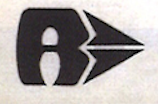
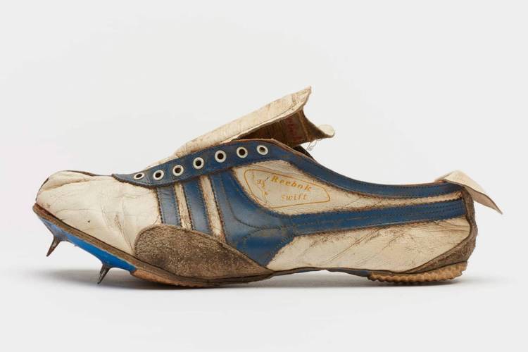
Jeff took this and split the cloven hoof to form a lateral and medial arrow, that seen from above replicated Barry’s arrowhead. A prototype was made and photographed and sent to adidas, who dropped their threatened legal action. Once again, the brothers had avoided catastrophe but now they had to find the money to retool their whole product line. They couldn’t afford that on top of the substantial legal costs, so Jeff just bought tools for the arrows and adapted them to fit.
In 1968 Joe began travelling to the Chicago Super show thanks to an offer to fund flights and accommodation from the UK Board of trade. A couple of years later he picked up a USA distributor; Bradford Distributors Corporation based in Huntingdon Valley Pennsylvania run by Shu Lang.
Sales started well then Joe got a fateful letter, Bradford had received a letter from a company called Brooks based in New England claiming that their arrow side mark was a copy of their side arrow. The brothers couldn’t believe it, they had never heard of Brooks, now they had to either fight or change again, so change they did. Jeff added a second length of trim from the ball to the heel, initially just for the USA, but as time passed UK too.

So that’s it how Reebok’s trademarked ‘Vector’ logo developed, not quite! In ’76 yet another legal challenge, this time from PUMA, claiming the new side stripe infringed their side stripe! The answer, split the forepart of the stripe as it passed under the arrow. PUMA would resurface again when Reebok Germany launched in 1986, this time they went for the aerobics shoes claiming tone on tone designs (where the side stripe matched the body of the shoe) infringed their logo and Reebok was forced to remove the side stripe in Europe and you got the difference between USA and EU Classic Leather™, Freestyle™ and Workout™.

©David Foster 2022
